JUMP TO SECTION
Overview
The Problems
Key Decisions
Student Side App
Student Library
Jobs Page
Trainer Side App
Batches

WORK FILE 03/05

WORK FILE 03/05

Redesigning the interactive learning web-app by Quest Alliance.

TYPE

Internship Project

TIMEFRAME

May - July'20

ROLE

UI Designer

PLATFORM

Mobile & Web

Quest project cover image

THE PROJECT

Quest Alliance is a social venture that works towards creating powerful teaching experiences for marginalized children & youth to realize their full potential.

As a design intern at HumanX, I got an opportunity to work on the QUEST App, an interactive learning platform to impart 21st century skills to learners.

Overview

  • QUEST App is an interactive learning platform to impart 21st century skills to learners making them more confident, adaptable & hence more productive.
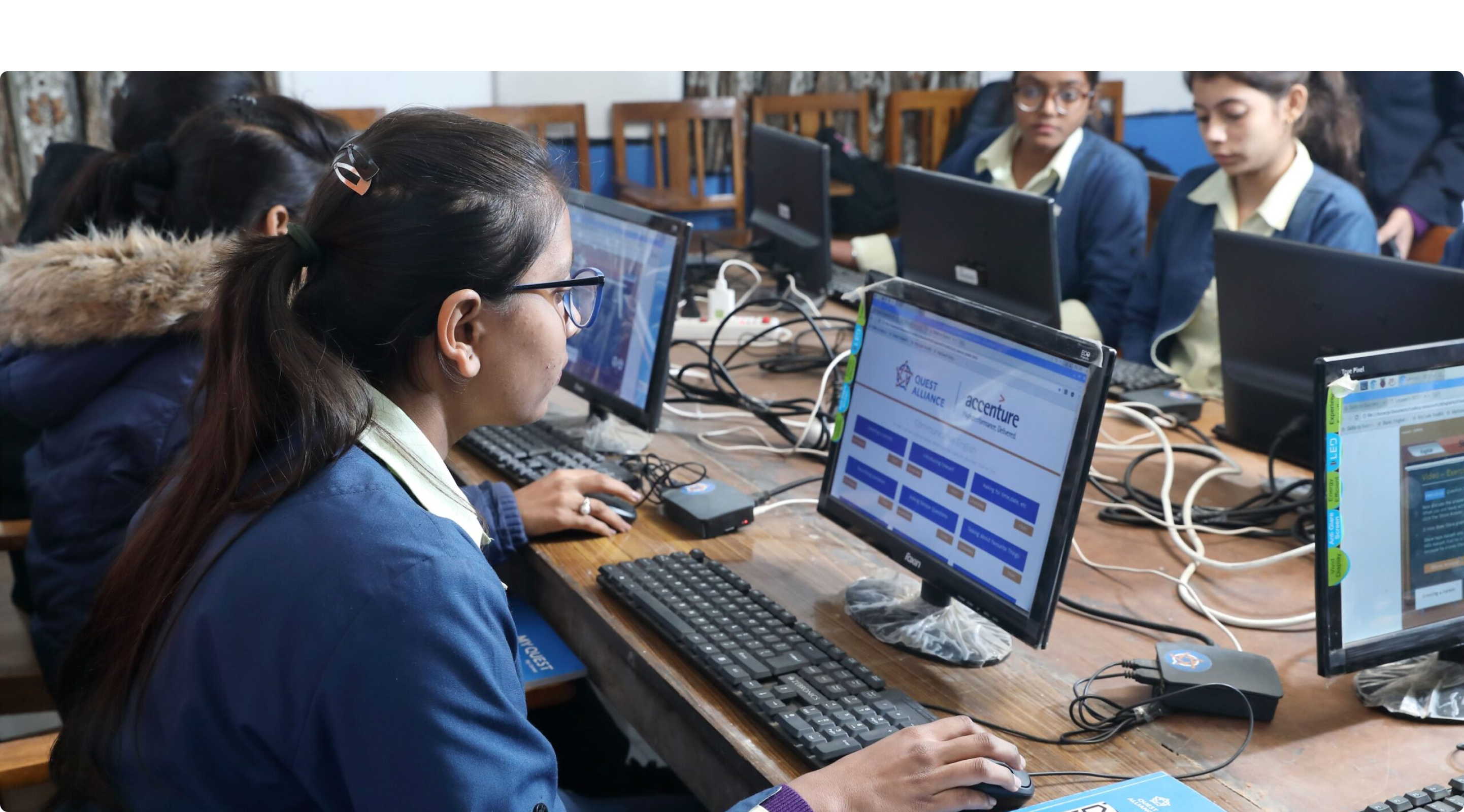
  • QUEST Learning centres adopt a “Blended learning model”, where students are physically present in the centre & are taught using the QUEST App. Therefore a basic & merely functional app was enough for the day to day teaching.
  • But due to the ongoing pandemic, the physical centres couldn't operate. Therefore, the students had to totally rely on the QUEST App. That's why the need for a redesign arose.
Screens compiled

My Role

  • By the time we became a part of this project, the team had already conducted onsite workshops and 1-to-1 interviews with the learners & trainers. I took out time to understand all the insights they had gathered.
  • I was a part of the discussions on user flows and the wireframes. Due to various constraints from the stakeholders, we couldn't alter the flows to a great extent.
  • I had a major role in the interface design phase, where I finalised the UI style and designed the screens for a majority of the flows.

Target Audience

Target Audience
  • A majority of the users have low tech exposure & are not comfortable with complex applications.
  • About 80% of the current batch didn’t have access to a laptop or tablet at home. But almost all of them had a smartphone in their families.
  • During the onsite workshops conducted by the team, it was found that most of the users were highly accustomed to the apps like Tiktok & Facebook.

The Problems

  1. The blended mode of teaching kept the learners motivated and encouraged to keep going and complete their subjects. The levels of motivation were falling due to the complete online shift.
  2. Loss of student-student interaction was leading to loss of interest.
  3. Students were finding it difficult to get their doubts cleared.
  4. Keeping track of student progress & information dissemination became difficult for trainers.
  5. Poor internet connectivity, lack of access to laptops, negativity during the pandemic etc, also needed to be addressed.

KEY DECISIONS

A number of solutions for the mentioned problems were proposed. The target audience was a major factor in filtering out viable solutions.

  • 80% of the students did not own a personal computer - a mobile app became essential.
  • To compensate for the loss of student-teacher interaction & progress tracking, a trainer-side app also had to be designed.

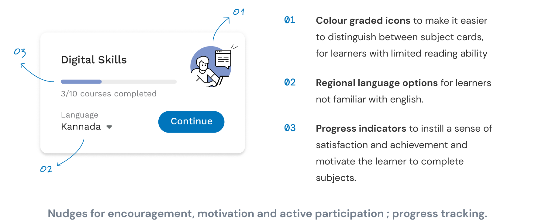
1 . Simplified journey with progress tracking

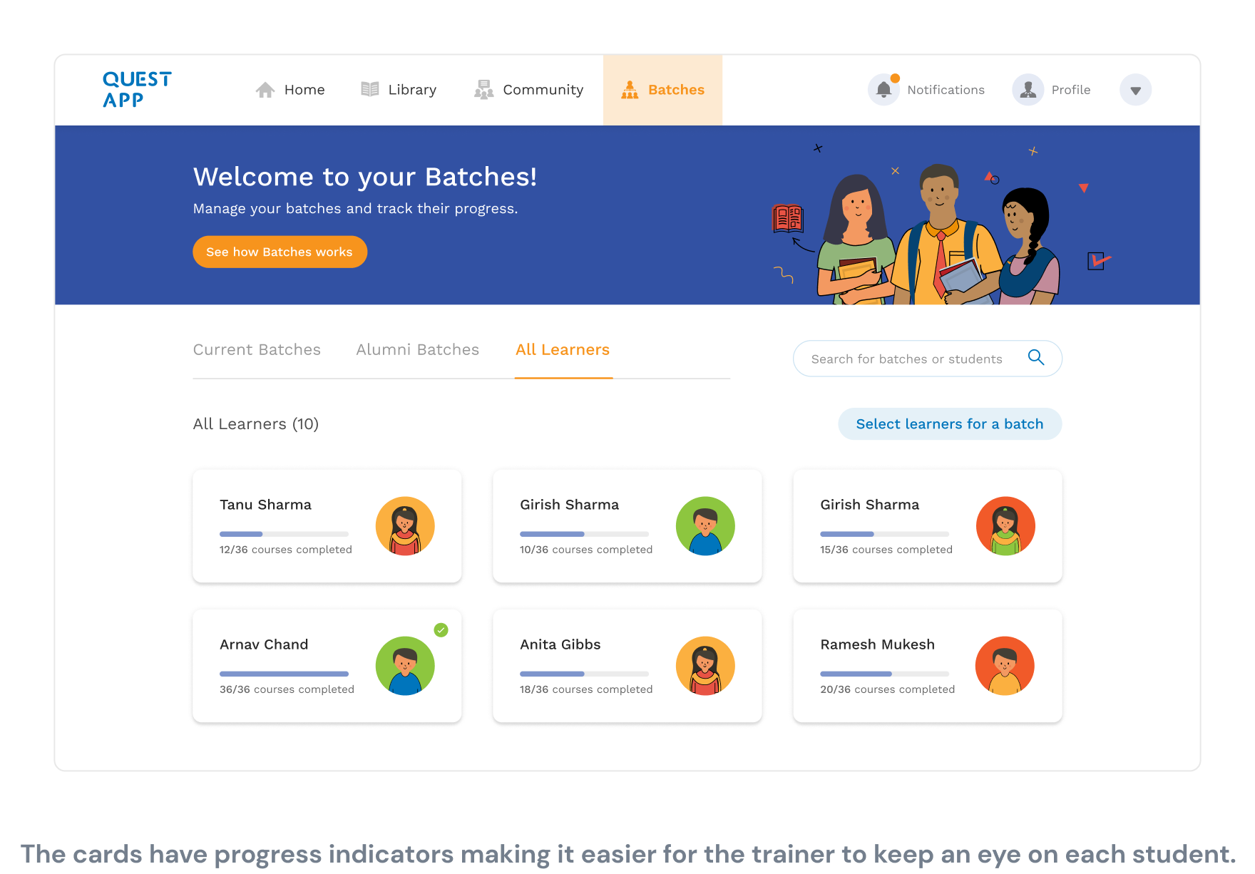
The user flows had to be very simple and straightforward owing to the low tech exposure & computer literacy. Student progress tracking were added at each step to keep the learners encouraged and motivated.

Progress tracking

2 . Nudges for icons and actions upfront

  • The team had discovered that most of the learners found it difficult to use popular apps as they didn't understand their interface.
  • Therefore, a descriptive name of each icon was provided next to the icons, because the icons alone might not be clear enough.
  • Also, a walkthrough videos were included in the header for each section of the app.
Top bar

3 . Nudges for active participation

To make up for the loss of student-student interaction, it was important to make the students participate in conversations among themselves. Therefore various alterations in copy and the UI elements were made to encourage active participation from the learners.
Student Side App

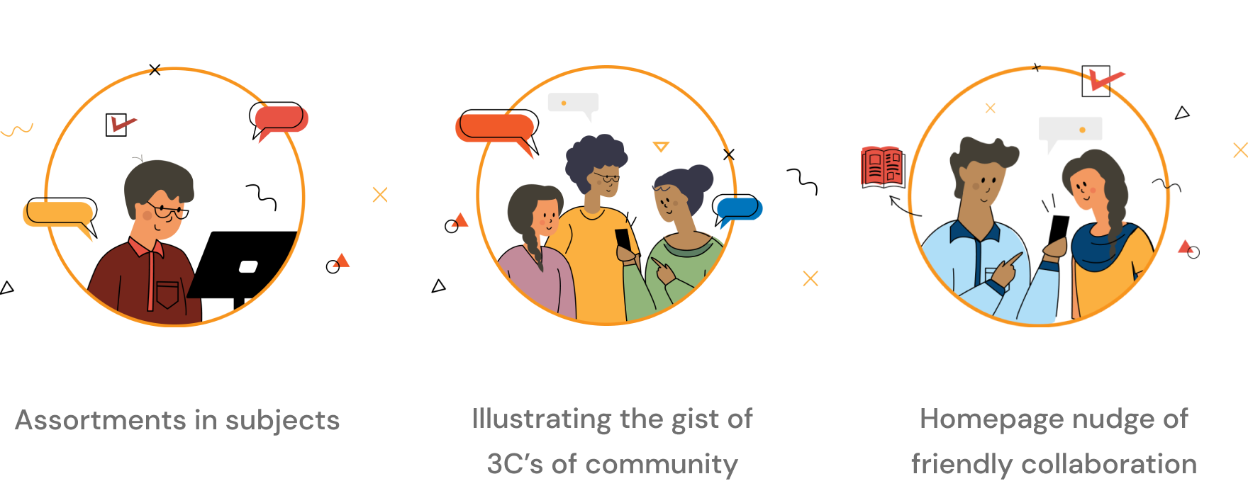
Illustration Style

  • A distinct illustrative identity was created to make the learner's experience fun and enjoyable.
  • The illustrations on each page are designed in such a way that they convey the function of that page.

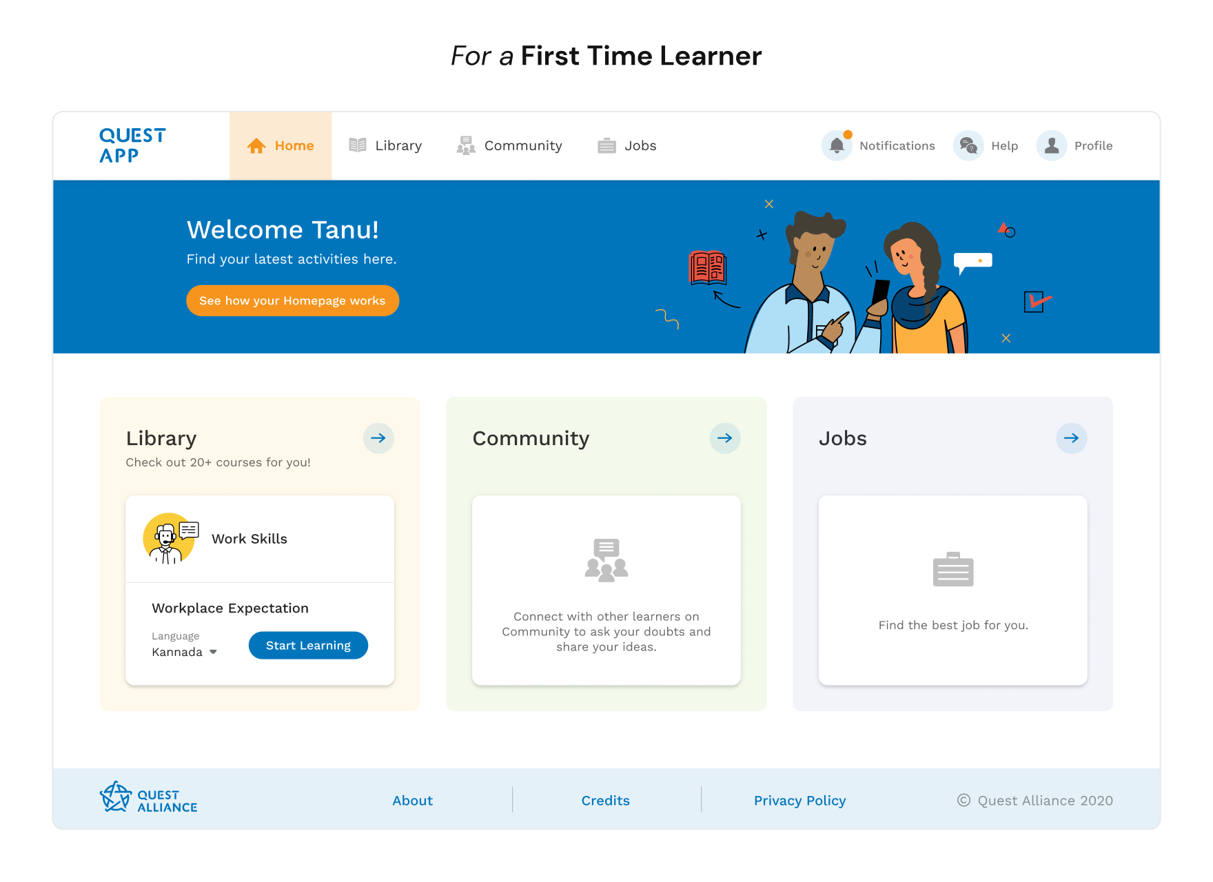
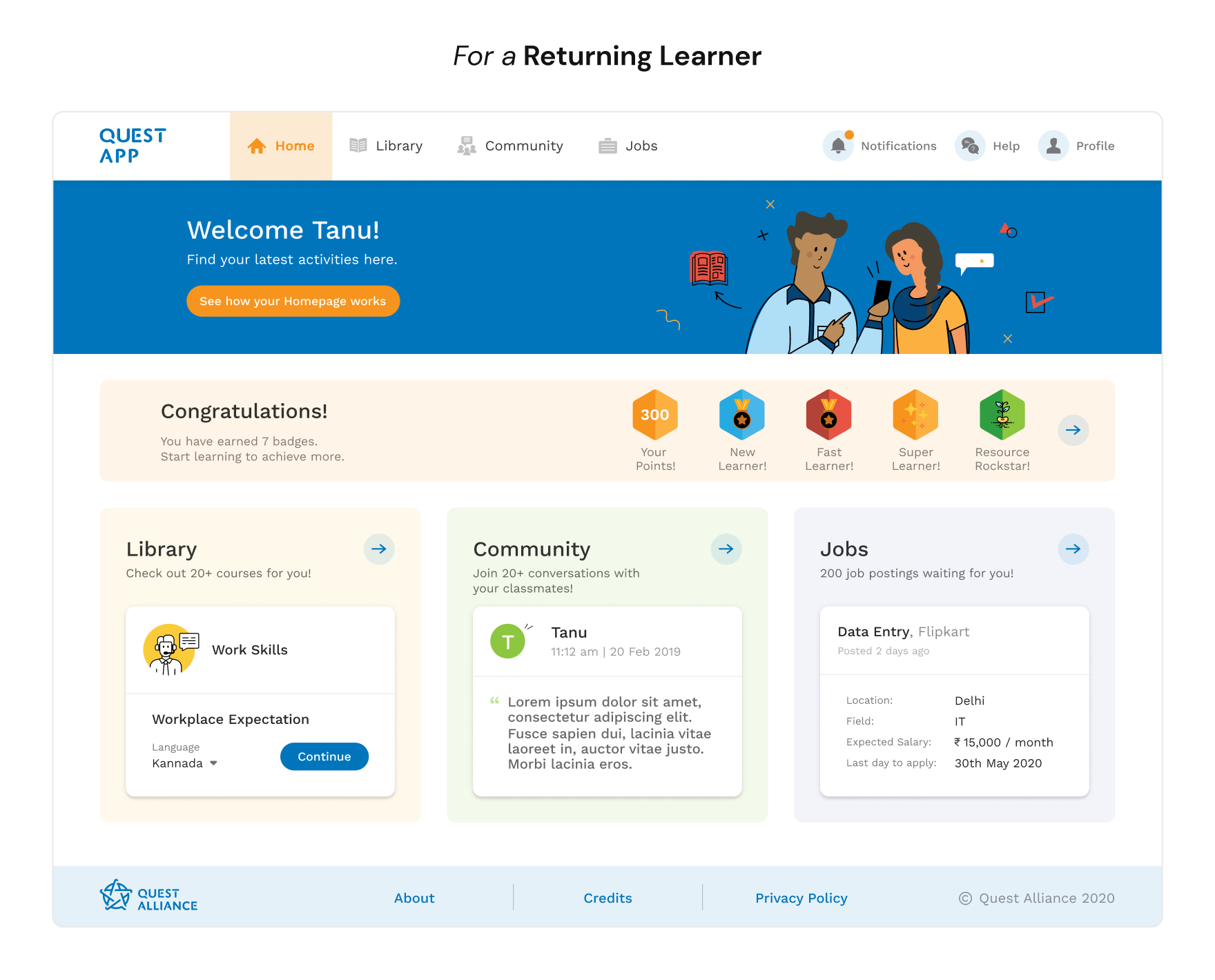
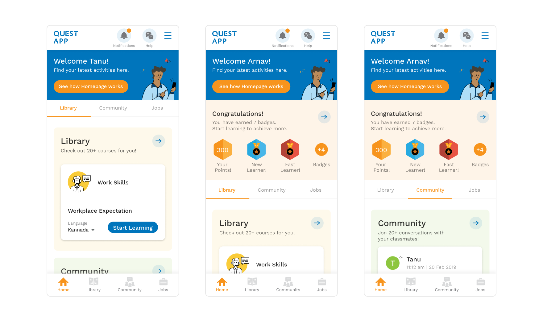
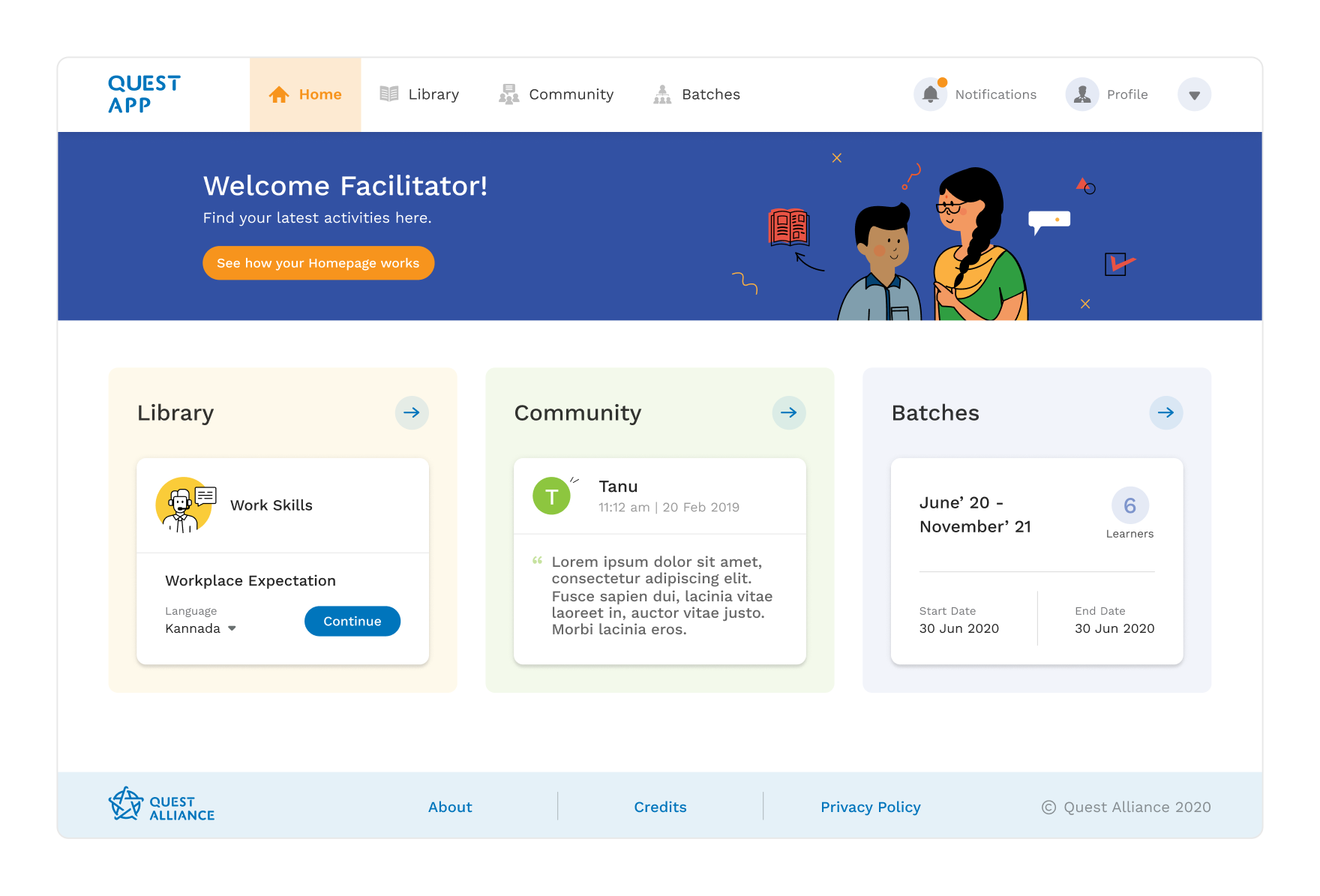
Home Screen

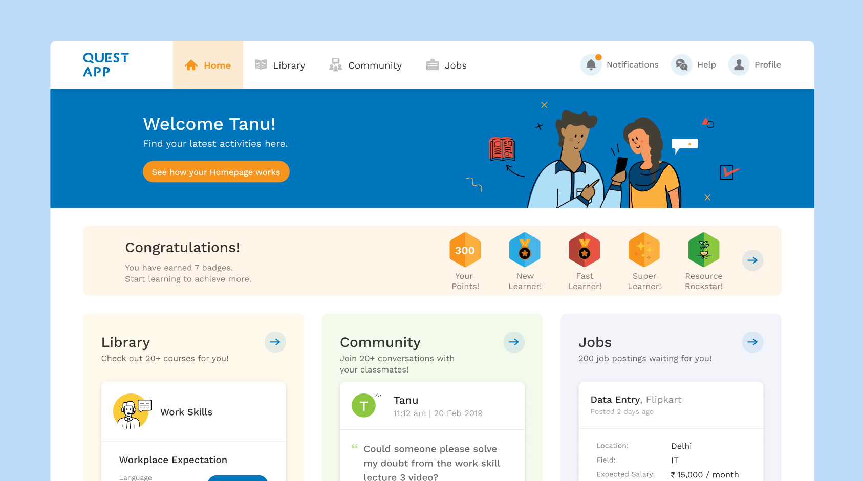
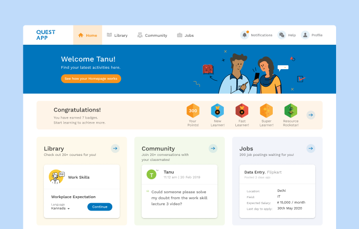
Home screen is the first page that the learners land on after logging into the app. Owing to the target audience of the app, the navigation to further pages (Library, Community, etc.) had to be extremely easy and intuitive, to avoid any confusion and frustrations.

For a first time learner For a returning learner Home cards Home screen on the mobile app

Student Library

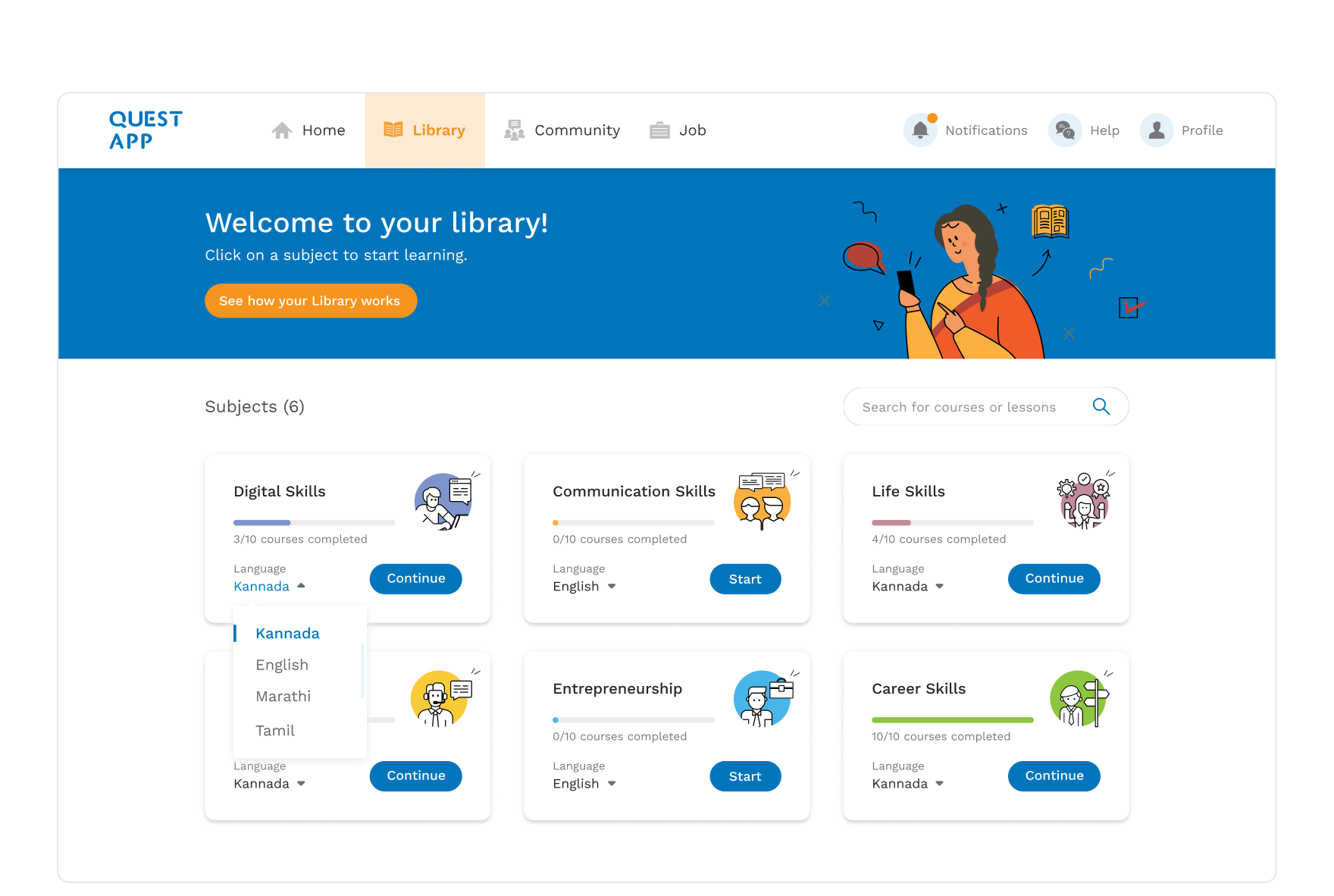
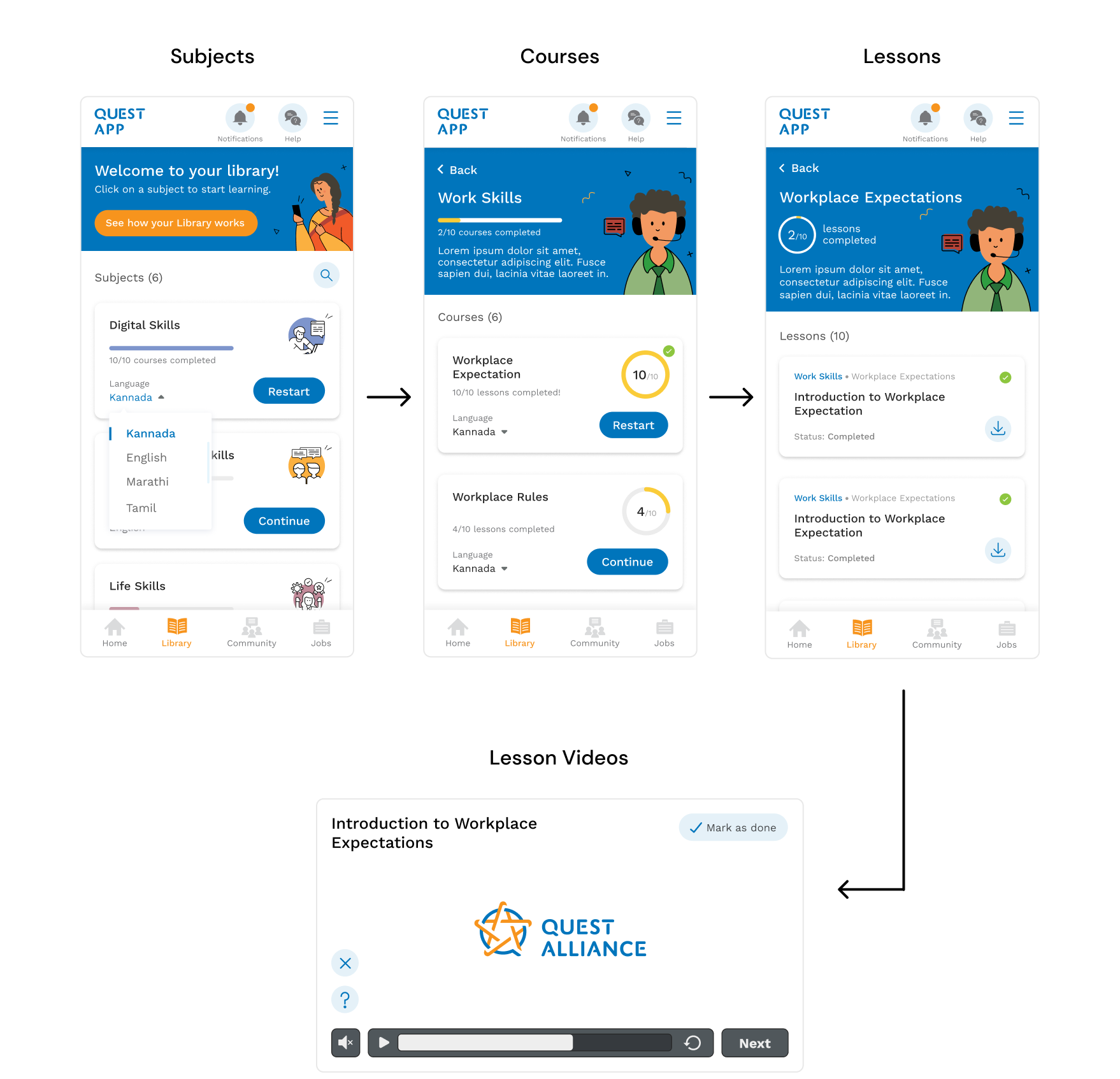
  • Student Library is where all the learning happens.
  • The Library consists of 6 "Subjects", that further have numerous "Courses" inside them. Each "Course" consists of interactive video lessons, regular assessments and textual resources for further reading.
Student library on the web app Explaination of the cards Student Library on the mobile app

Jobs Page

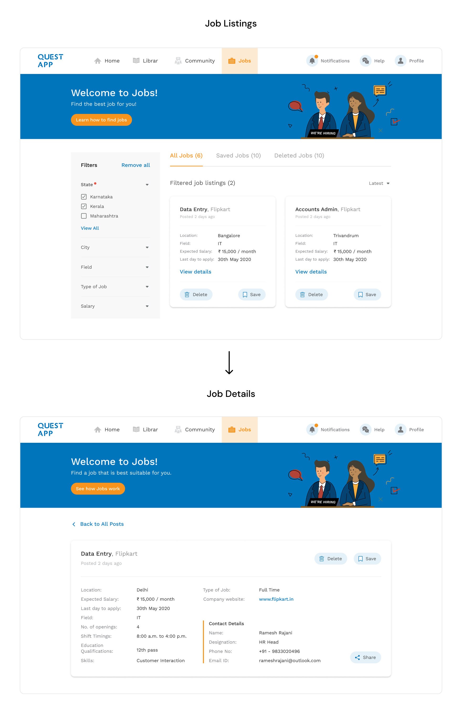
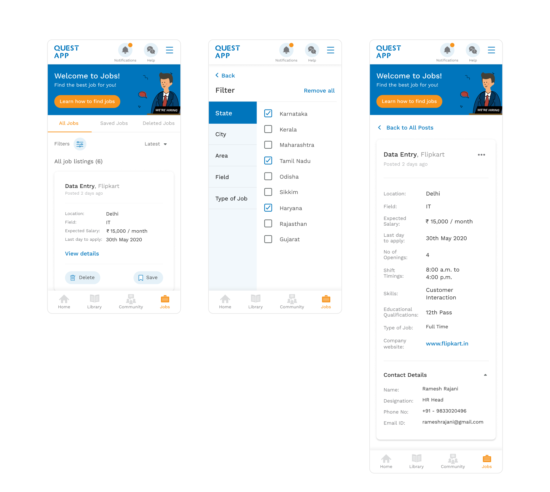
  • The jobs page is a new page that didn't exist in the original QUEST App.
  • QUEST’s mission has always been to impart practical skills to the youth to make them job-ready.
  • These jobs can be posted by trainers, as well as the alumni of the programme.
  • Learners can save / delete jobs to customise their feed to their preferences. They also have the option to filter job listings based on several criterias.
Jobs page on the web app Jobs card Jobs page on the mobile app

Student Community

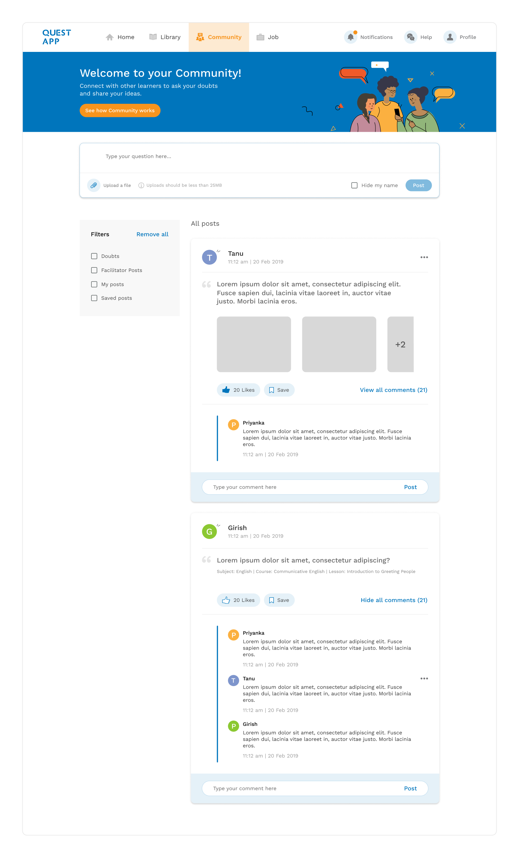
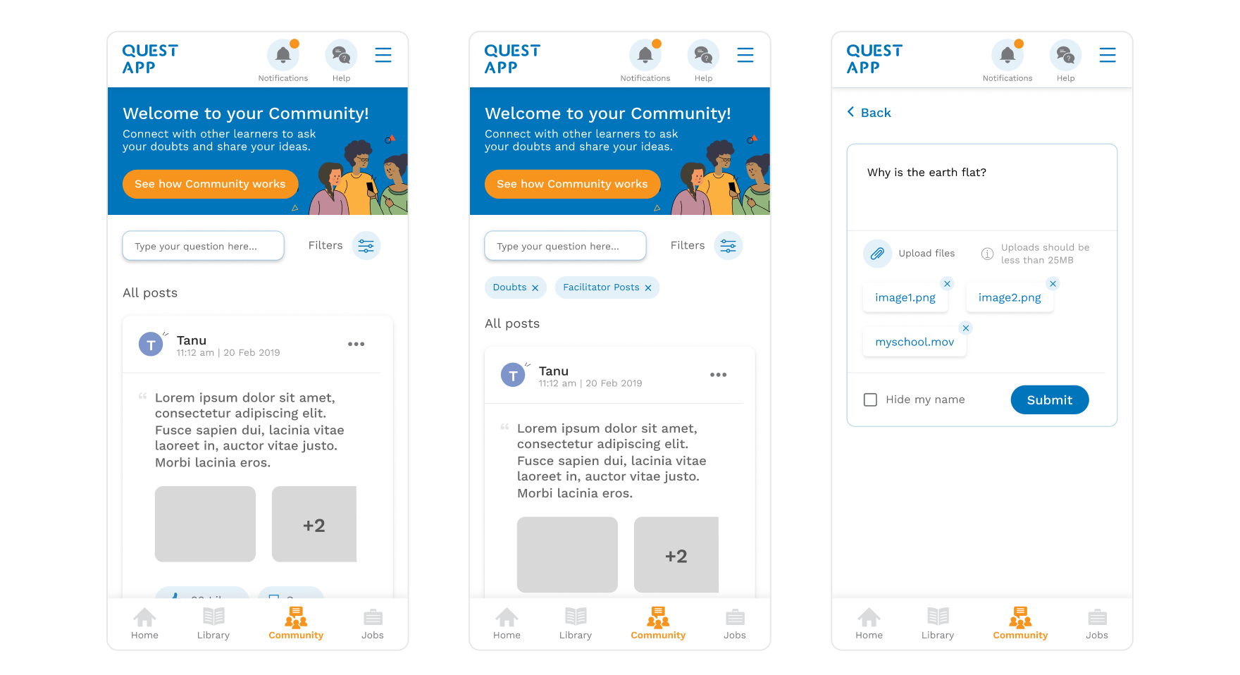
  • The main aim of the Student Community is to foster better student-student and student-teacher interaction. The community page allows the students to share content along with their classmates and also post their doubts.
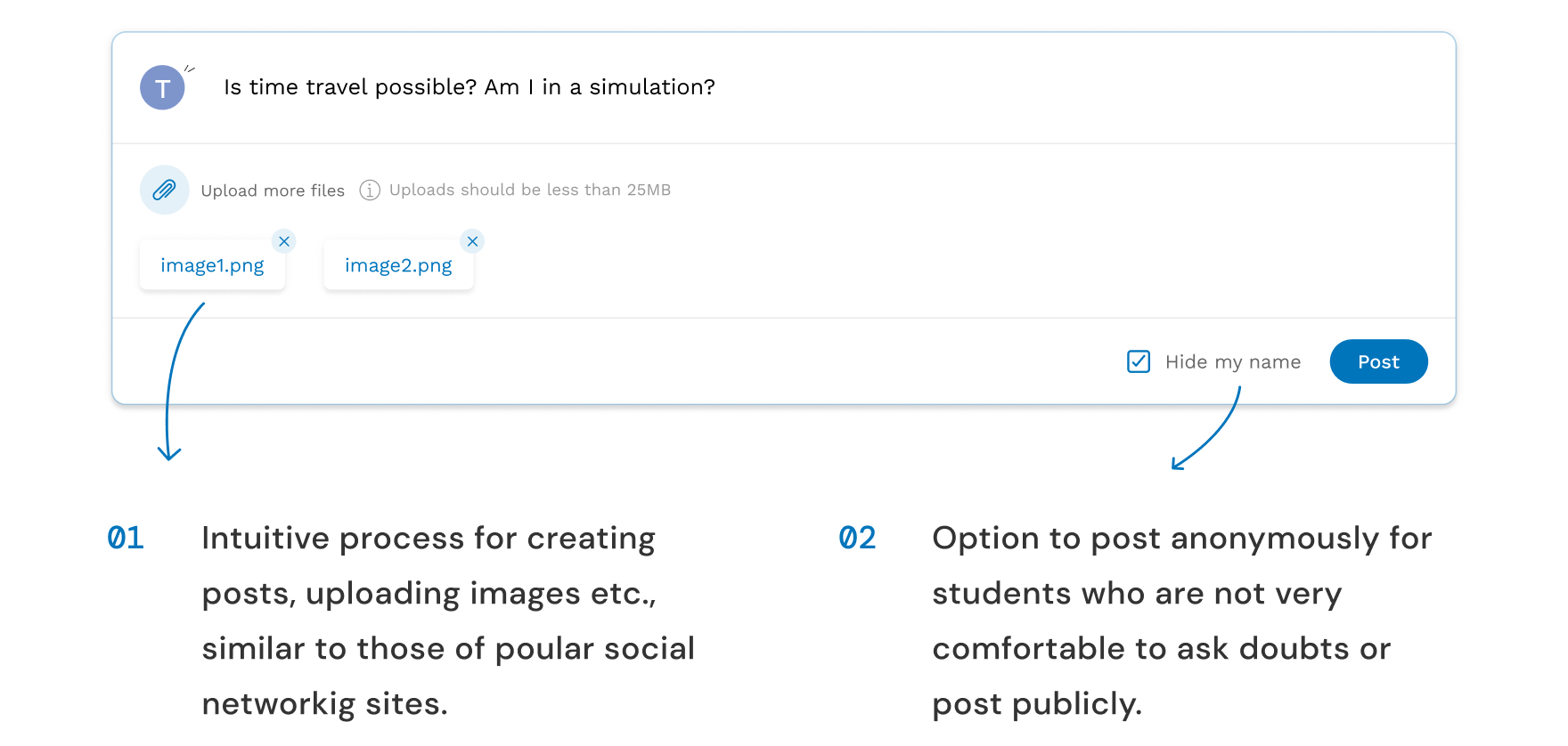
  • The posting flow has been kept similar to popular social media sites like Facebook, as the learners were already accustomed to them.
  • "Type your own question here" field at the top nudges the learner to participate in the community.
Community on the web app Community on the web app Community on the mobile app

Trainer Side App

Trainer Home

Homescreen of the trainer side app

Trainer Community

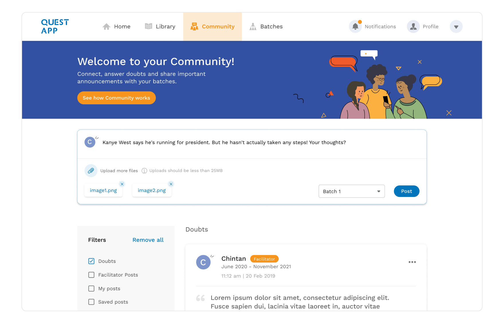
  • The Community feature for trainers allows them to share content (files, lessons, announcements) with their batches.
  • The trainers can also address the doubts of their students through the community page.
  • The trainers also have the special ability to delete the posts that are offensive or inappropriate.
Community page on the trainer side app

Batches

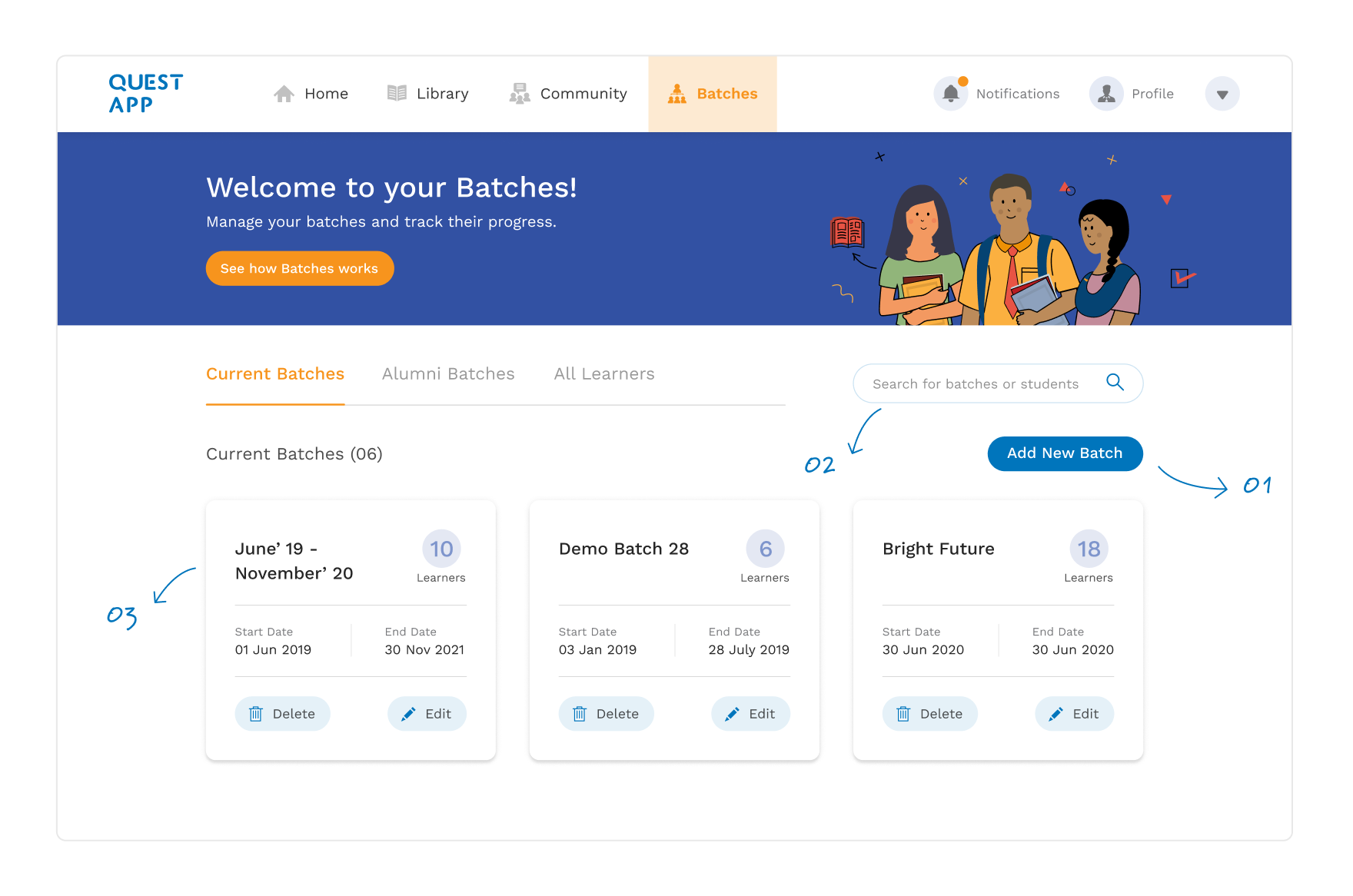
  • Students enrolled in the QUEST educational program are divided into batches, where each batch is supervised by atleast one trainer.
  • Trainers can have multiple batches under their supervision.
  • Earlier batches were managed on a separate portal. But with this redesign, we decided it was best to integrate the batch management feature in the trainer-side app itself.
  • This makes it easier for trainers to keep an eye on the progress of the students in their batches.
Batches Batch cards

My Learnings

  • This was the first time that I got the opportunity of working on such a vast project, with such a large and positive impact.
  • My work was more focused on interface design. That allowed me to learn about interface design nuances, which I would have conveniently ignored in the past.
  • Moreover, this being my first project to go live, I understood a lot about developer handoff tools like Invision and Zeplin.